
BigML Brand Style Guide
These brand guidelines explain how to use our visual identity with confidence and clarity. Our guidelines have been designed to ensure consistency within our brand, helping to create strong, recognizable, and innovative communications.
Primary Logo

Secondary Logo

Logo versions
You must use the logo version which is appropriate for the work you are doing.



LIGHT BACKGROUNDS



DARK BACKGROUNDS



SINGLE-COLOR ON LIGHT BACKGROUNDS



SINGLE-COLOR ON DARK BACKGROUNDS
Clear space
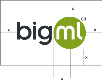
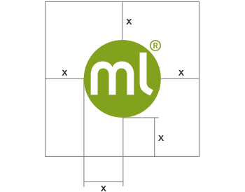
To protect the clarity and visual integrity of the logo, it has an exclusion zone. Measure clear space from the radius of the ML ball. Never allow typography or other elements to 'invade' the logo. Never redraw or alter the logo, including the placement and size relationship of the letters or symbol. It must always appear legibly on a clear background.
Brand colors
Secondary palette colors
Typography
We use Hevetica Neue for our claim and website.


Modeling Resources
Icons and workflow diagrams of the BigML platform.

